Expert
Exchange
The Challenge
To design an app which allows people to easily get in touch with a number of experts and ask questions
Duration
6 Months
The Process
End-to-End design process meant starting with competitive analysis and finishing with iterations based on usability tests, conducted using wireframes and prototypes, with every step in between.
Role
UX/UI Designer.
I also looked after research and data analytics as this was a solo project for CareerFoundry’s UX immersion course
Tools
Figma | Pen & Paper | Sublime | Lyssna
Competitors
JustAnswer
What are they selling?: An online platform in which people can talk to experts in a very wide range of fields for a subscription fee
What are they communicating through their product?: Expert advice with verified professionals
What are they missing in their messaging, product, and overall offering?: The ability to ask questions before committing to a subscription fee
Quora
What are they selling?: A free service which allows people to post questions and others can answer. You can sign up to an add free version for a fee
What are they communicating through their product?: Answers to any question posed on the website. This can be answered by anyone with an account set up with Quora
What are they missing in their messaging, product, and overall offering?: A more expert-focused approach by only allowing verified experts to answer questions.

Problem Statement
Our app users need a way to quickly engage in conversation with experts whom they can trust and gain advice from because they would like to refer to this information when trying to complete specific tasks such as modelling their house.
We will know this to be true when we see how many people are using our app to pay experts and how much they are contributing towards reviews of these experts.
User Persona

Name: Grace Lovage
Age: 25
Occupation: Barista
Gender: Female
Location: UK
About:
Grace lives a busy life and has a sporadic work schedule. She is very outgoing and uses her social media much of the time. She loves travelling and wants to do more.
Quote:
“I love spending time with my friends and travelling to places I haven’t been before.”
“I would like to get some more advice on where I can travel in and out of my country.”
Status: Single

Personality:

Technical Skills:
Frustrations:
Spending too much money
Outdated apps
Lack of creativity
Motivations
Chatting with people
Career
Impressing friends
Goals and needs
Travelling more
Learning new skills
More understanding of different places
User Journey Map

User Flows
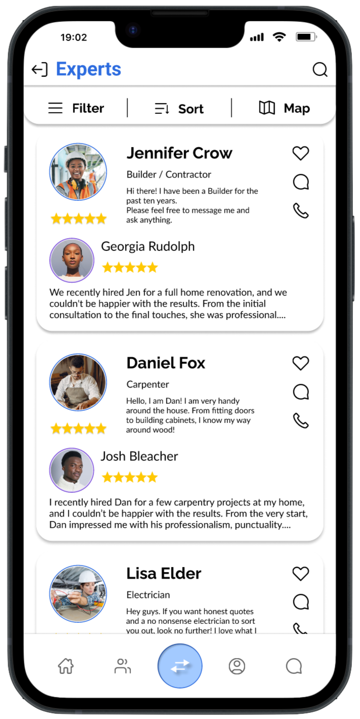
This user flow illustrates how a user would be able to chat with an expert.
There are multiple routes that the users can take and it starts from the moment they open the app.
I chose this user flow because it is an important feature within the app and relates back to my problem statement. (Our app users need a way to quickly engage in conversation with experts).
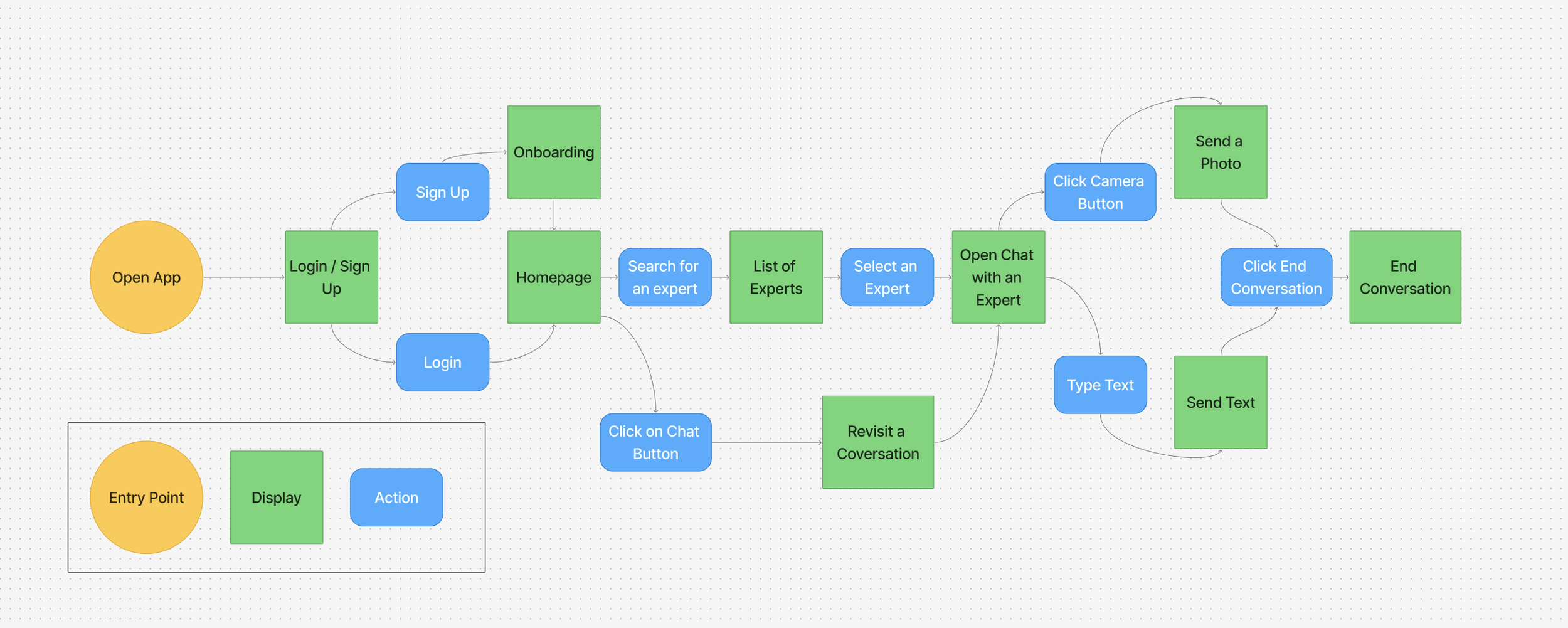
This user flow also relates to another part of my problem statement.
(…they would like to refer to this information when trying to complete specific tasks)
This shows how users can start conversations as well as revisit them.
Using Card Sorting to Improve a Sitemap
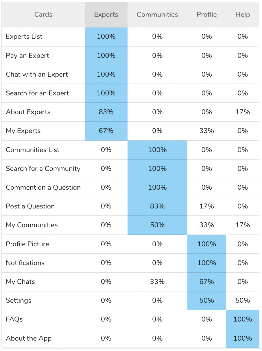
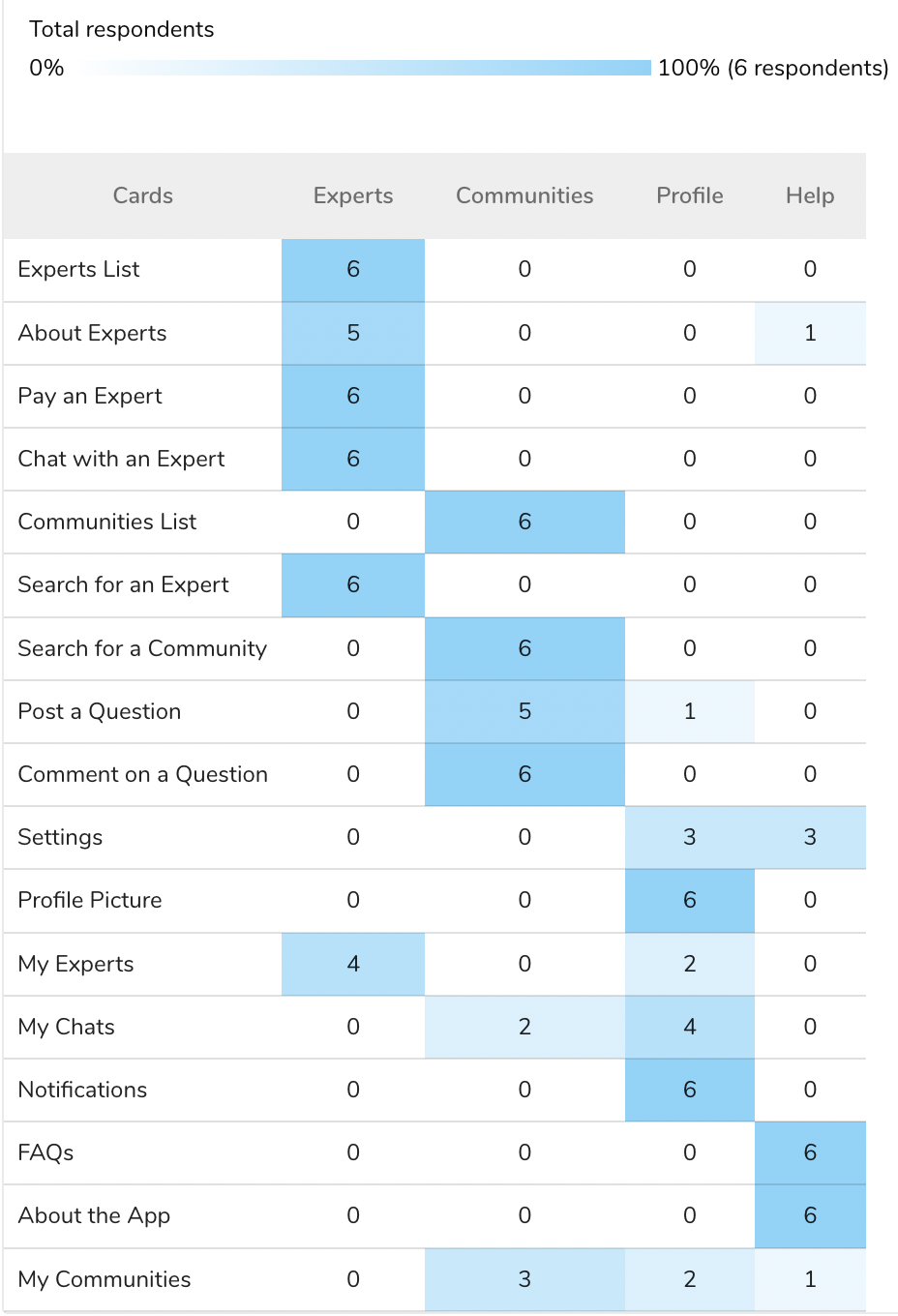
← Results Matrix
Popular Placements Matrix →
We can see from these matrix, that some categories are highly agreed upon. Whereas, some have low - medium agreement.
This was helpful when updating my sitemap

Before Card Sort

After Card Sort

Usability Testing - Rainbow Spreadsheet

By using a rainbow spreadsheet, I was able to make quick decision on improvements that needed to be made and how important they were.
This was also an effective way to communicate with the rest of the team.
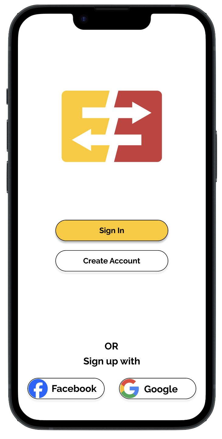
Preference Testing
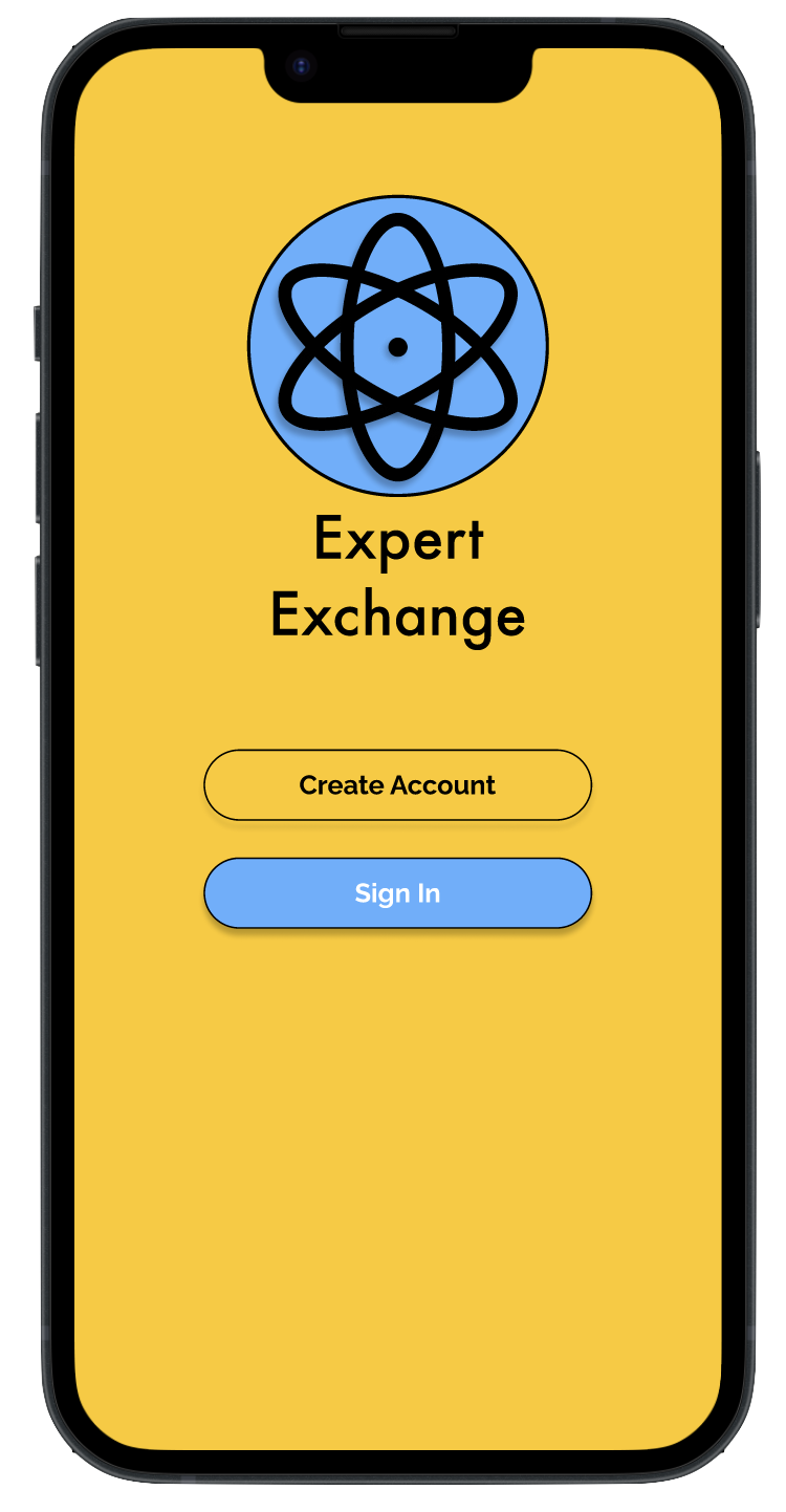
Original Design
Preference Percentage: 30%
Feedback:
More rounded, softer
Stood out more
There is less going on and the options are more clear
Updated Design
Preference Percentage: 70%
Feedback:
Eye catching Design
Very clear logo and perfectly chosen colours
More pleasing to the eye and easier to navigate
Design Collaboration

Emotional Engagement - Colour Strategy
Red and Yellow - the backlash of these colour choices is that yellow could become overwhelming and tiring for users.

Original Design
While, red can be associated with danger or mistakes. The other issue is that the red and yellow combo could be associated with McDonald’s - an undesired effect.
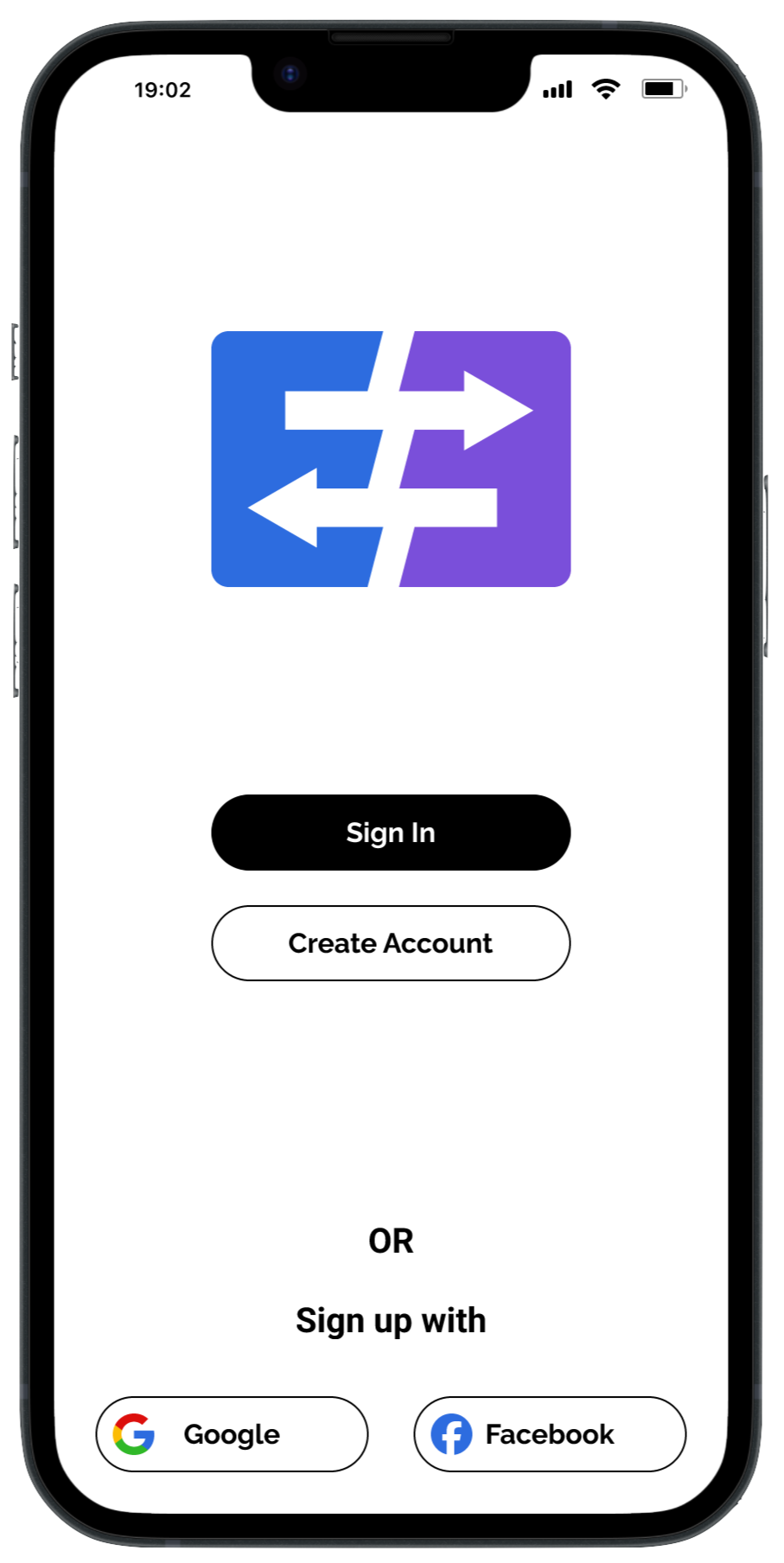
I have chosen to move to a Blue and Purple design. Blue is often associated with trust and reliability. While, Purple conveys compassion, solidarity, and community.

New Design
I have also checked the colour contrast of the newly chosen colours against the Figma Stark plugin in order to make sure that I am still designing with accessibility in mind.
Conclusions
Results
The original objective was reflected in the final results of the app. With users being able to contact experts quickly and with ease. They were able to asks questions and gauge trust based on expert reviews. While the functionality of the app lined up with the original objective, the over all look and features of the app were, in the end, quite different. For example, the features included in the bottom navigation were changed along with the onboarding process after having conducted the usability tests. This was a pivotal point in the development of Expert Exchange which helped us to understand how users would interact with the app.
Challenges
The most surprising challenge I faced was making decisions based on split reviews from some tests. For example, when conducting card sorting tests, some of the results were 50/50 so it was difficult to make decisions with this data. I was able to overcome this by creating solutions which would work for both parties.
Learnings
Given the chance to do this project again, I would conduct more preference tests at an earlier stage in the design. This would save time in the early stages of the project and help to gain a better understanding of the overall feel of the app. I would also be able to gain more understanding about the users early on.